

TOSTEM WE 70 Aluminium Windows & Doors | Social Media Case Study
One system, many possibilities.
Discover how TOSTEM WE 70 brings together modern design and versatile window and door solutions—from sliding and casement to awning, fixed, swing, and louver styles. Find the right fit for a brighter, more comfortable space.
- Client
- Tostem by Candi
- Category
- Social Media Design
- Industry
- Finished Good Aluminium
- Timeline
- 3 days
Project Overview
The Challenge
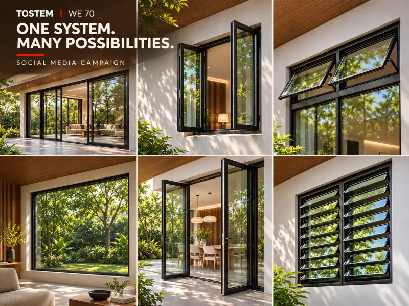
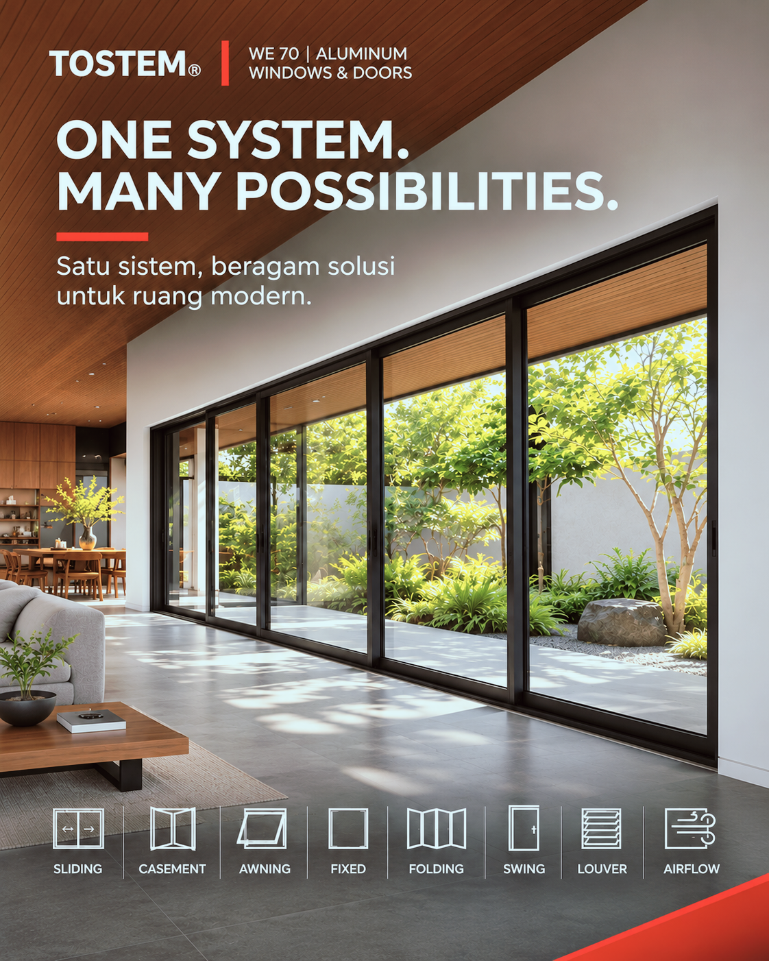
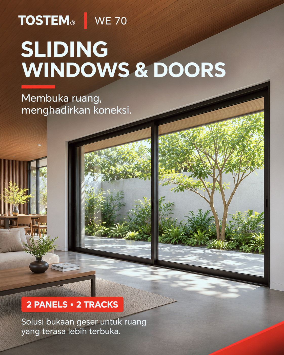
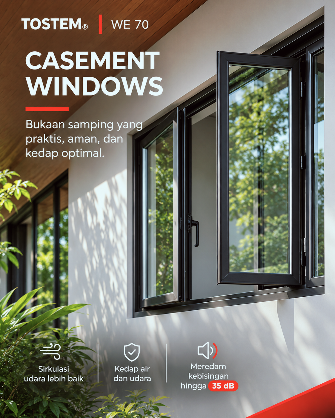
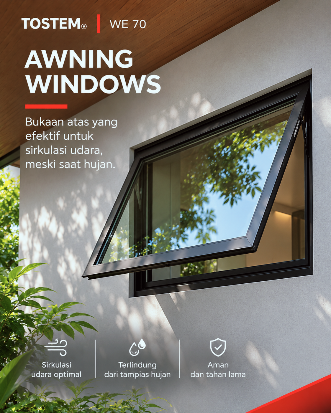
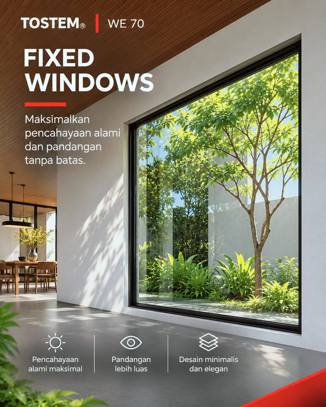
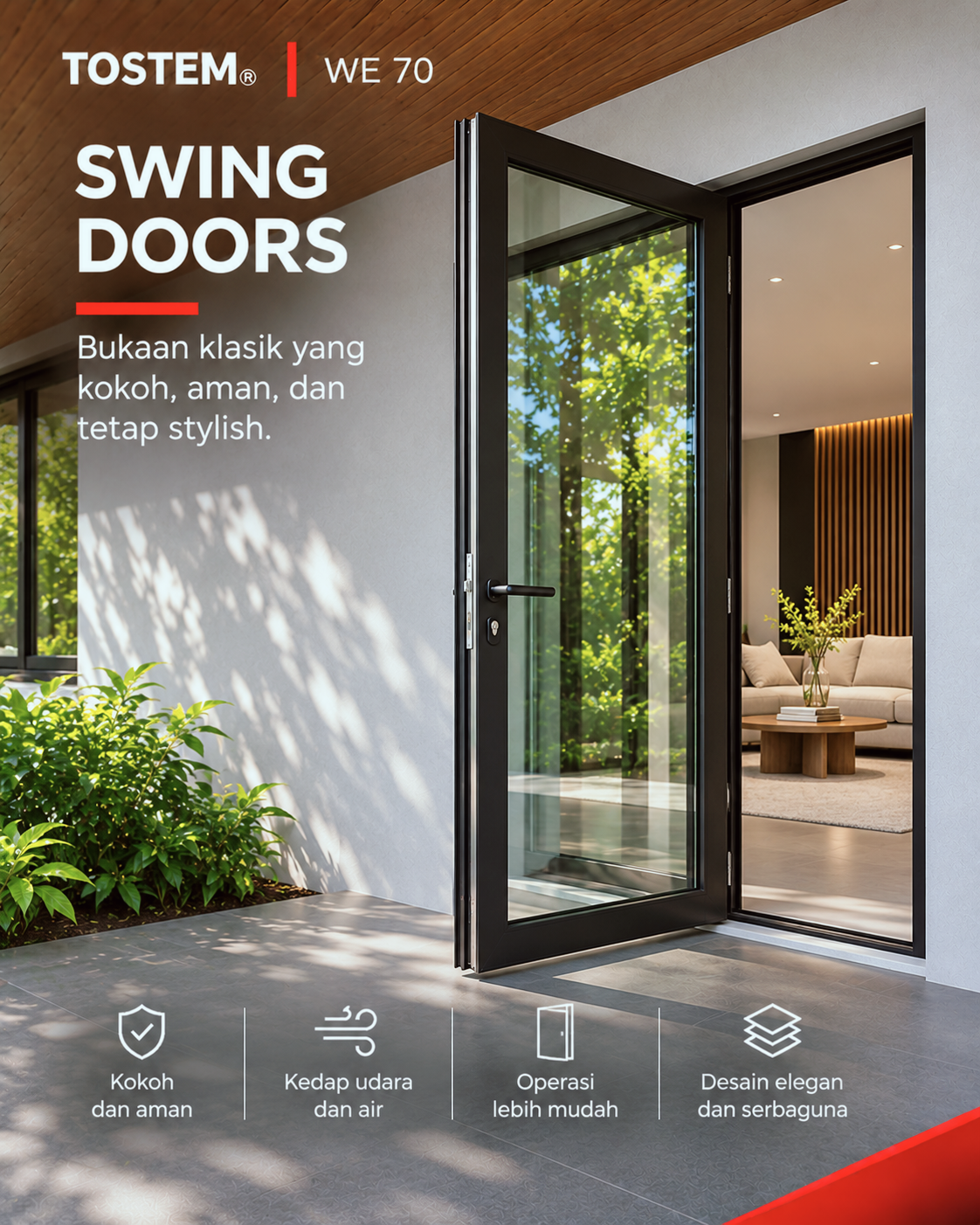
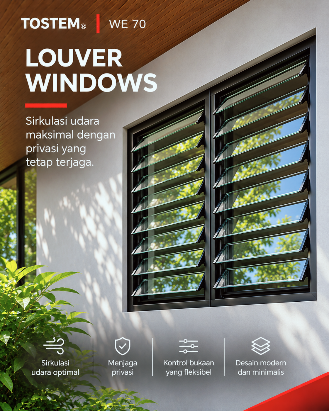
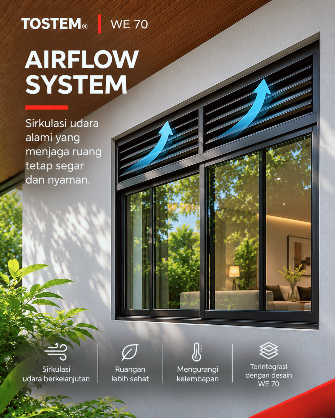
The campaign introduces TOSTEM’s WE 70 aluminium window and door system to homeowners, architects, and people planning modern spaces. The content focuses on one key message: one system, many possibilities. A series of product visuals highlights different options—sliding, casement, awning, fixed, swing, louver, and airflow—along with benefits such as natural light, ventilation, privacy, weather protection, and noise reduction.
The Solution
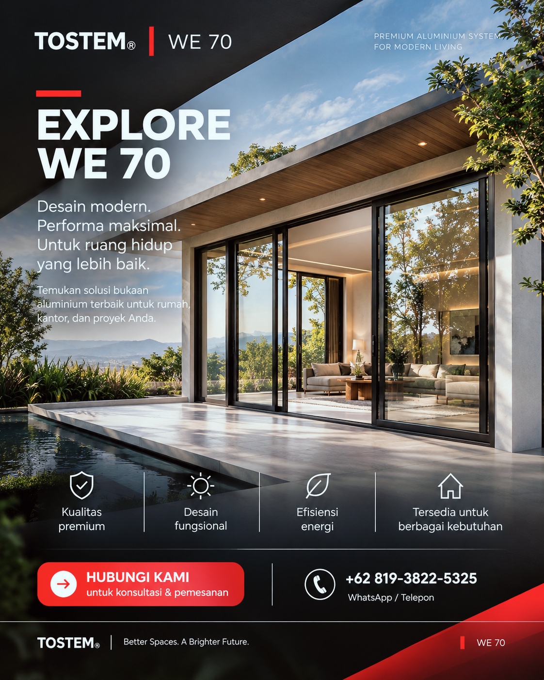
The campaign uses a cohesive series of social media graphics with a premium, modern residential look. Each post spotlights one product type or feature, using clear headlines, concise Indonesian copy, and simple benefit icons. The sequence moves from introducing the WE 70 range to explaining individual solutions, then closes with a wider “Explore WE 70” message and a consultation call to action.
Goals
- Build awareness of the TOSTEM WE 70 system and its range of configurations.
- Help audiences understand how each window or door style can support different needs and spaces.
- Position TOSTEM as a premium, modern solution for homes, offices, and projects.
- Encourage interested audiences to contact the brand for consultation or ordering.
Gallery
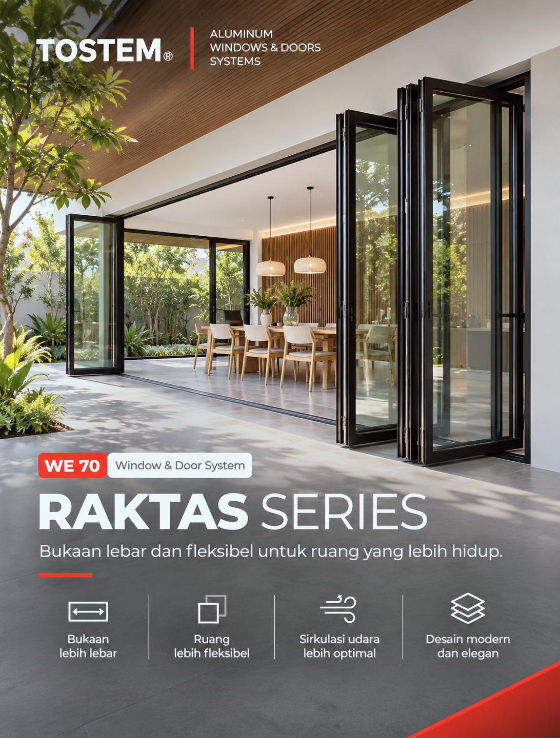
How this brand identity was approached
The identity for Tostem by Candi started with the questions that matter before any logo sketch: who the brand speaks to, what it should feel like, and where it will be seen most — signage, packaging, social media or a website.
From there, the logo, colour palette and typography were developed together as one system, tested at small and large sizes, in colour and in one colour, so the brand stays recognisable everywhere it appears.
The finished identity is then applied to the touchpoints the business actually uses — business cards, social media templates, signage or packaging — so the team can start using the new brand straight away instead of receiving a logo file alone.
Planning something similar? See my brand identity service or estimate your project.
- 1
Discovery
Audience, competitors, personality and where the brand will live.
- 2
Concepts
Logo directions with colour and type, presented in real mock-ups.
- 3
Brand kit
Final logo files (vector & PNG), colours, fonts and usage guidance.
Have a project in mind?
Tell me about your goals. I’ll reply within one business day with a clear next step — or get an instant estimate with the calculator.