

Kreatif Ninja Business Card
Kreatif Ninja — Business Card Design
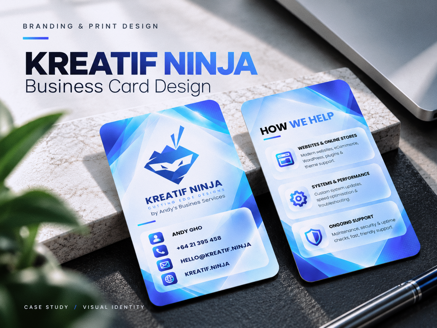
A modern business card design concept created for Kreatif Ninja, combining bold blue tones, geometric graphics, and clean typography to communicate a professional, technology-driven brand identity.
The design balances brand recognition, accessible contact information, and service communication across both sides of the card. A consistent visual system, intuitive icons, and structured layouts help present the brand’s services in a clear and engaging way.
Services: Graphic Design, Brand Identity, Print Design, Layout Design, Visual Communication.
Design Focus: Modern aesthetics, brand consistency, readability, and professional presentation.
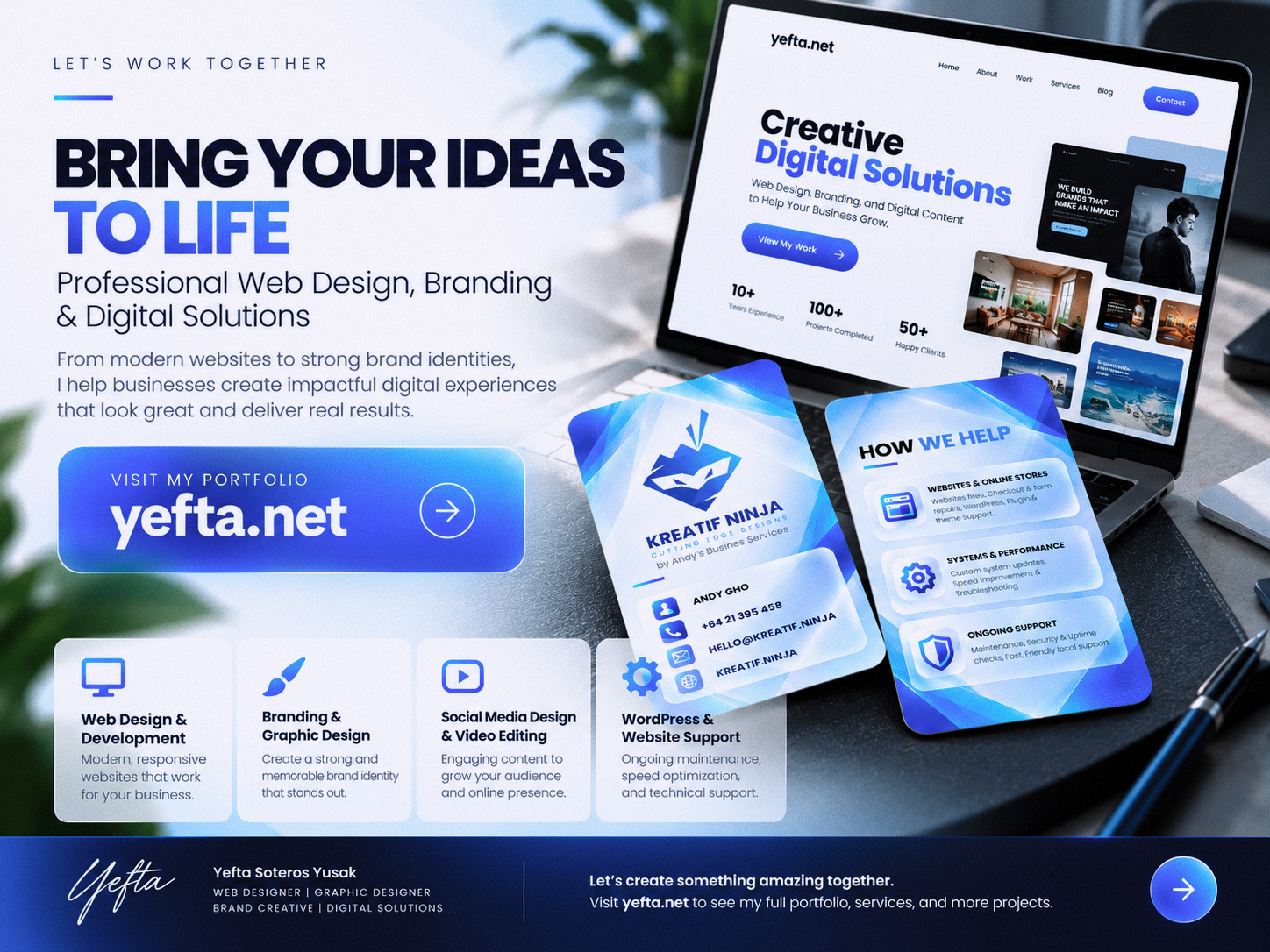
Explore more of my work at yefta.net.
- Client
- Kreatif Ninja
- Category
- Brand Identity & Business Card
- Industry
- Creative Agencies
- Timeline
- 3 Days
Project Overview
The Challenge
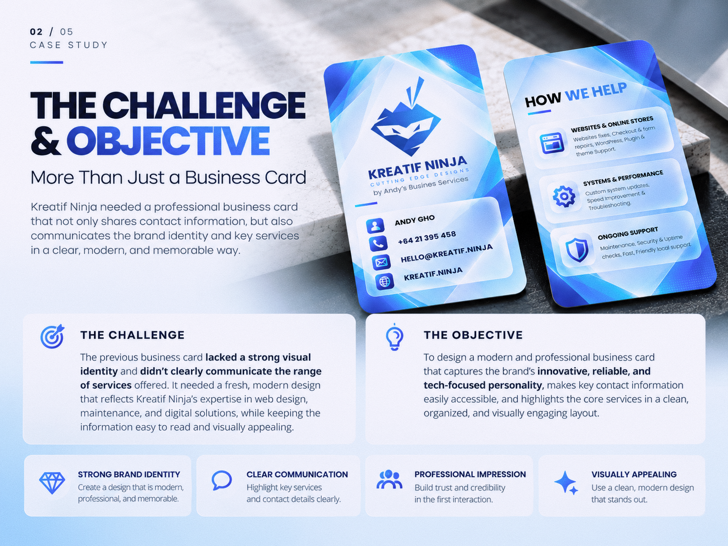
The challenge was to create a business card that could communicate Kreatif Ninja’s professional identity and range of digital services within a compact format.
The design needed to balance brand recognition, contact information, and service descriptions without overwhelming the layout. It also needed to reflect the brand’s modern, innovative, and technology-focused personality while maintaining clarity and readability.
The Solution
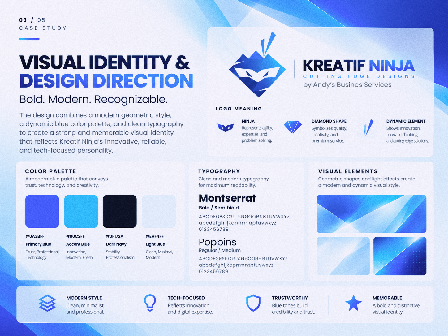
I developed a modern business card concept using a bold blue-and-white palette, geometric graphics, and clean typography to create a cohesive visual identity.
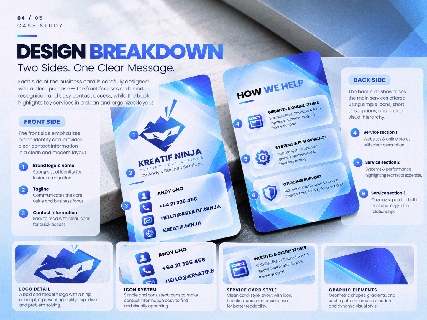
The front side prioritizes brand recognition and accessible contact details, while the back presents key services through structured content, intuitive icons, and clear visual hierarchy. Consistent spacing, rounded panels, and dynamic graphic elements bring both sides together into a professional and memorable design.
Kreatif Ninja — Business Card Design Case Study
A business card is more than just a way to share contact details. It's an opportunity to make a lasting first impression.
For this project, I explored how a modern business card could communicate Kreatif Ninja's brand identity while presenting its services in a clear, professional, and visually engaging way.
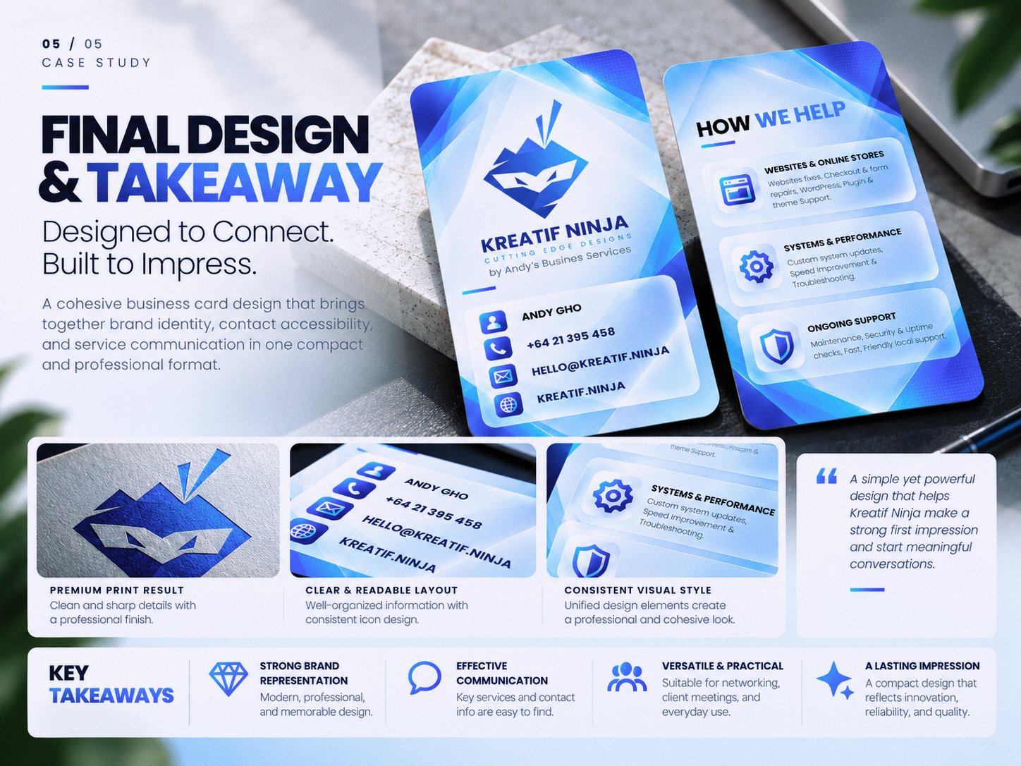
From the bold blue color palette and geometric graphics to the typography, icon system, and information hierarchy, every design element was considered to create a cohesive visual experience across both sides of the card.
Here's a look at the design process:
🔹 The Challenge — Balancing brand recognition, contact accessibility, and service communication in a compact format.
🔹 The Design Direction — Building a bold, modern, technology-focused visual identity through color, typography, and geometric elements.
🔹 The Design Breakdown — Exploring how layout, icons, and structured service sections make information easier to navigate.
🔹 The Final Design — Bringing everything together in a cohesive business card concept designed to represent the brand professionally.
This project reflects my approach to graphic design: combining visual appeal with clarity, purpose, and practical communication.
Looking for professional design, branding, or website solutions for your business?
🌐 Explore my portfolio: https://www.yefta.net
Let's create something meaningful together.
#GraphicDesign #BusinessCardDesign #BrandIdentity #VisualIdentity #BrandingDesign #CreativeDesign #Portfolio #YeftaNet
Gallery
How this brand identity was approached
The identity for Kreatif Ninja started with the questions that matter before any logo sketch: who the brand speaks to, what it should feel like, and where it will be seen most — signage, packaging, social media or a website.
From there, the logo, colour palette and typography were developed together as one system, tested at small and large sizes, in colour and in one colour, so the brand stays recognisable everywhere it appears.
The finished identity is then applied to the touchpoints the business actually uses — business cards, social media templates, signage or packaging — so the team can start using the new brand straight away instead of receiving a logo file alone.
Planning something similar? See my brand identity service or estimate your project.
- 1
Discovery
Audience, competitors, personality and where the brand will live.
- 2
Concepts
Logo directions with colour and type, presented in real mock-ups.
- 3
Brand kit
Final logo files (vector & PNG), colours, fonts and usage guidance.
Related projects
Have a project in mind?
Tell me about your goals. I’ll reply within one business day with a clear next step — or get an instant estimate with the calculator.