

Andy’s Business Services – Desain Identitas Merek Profesional
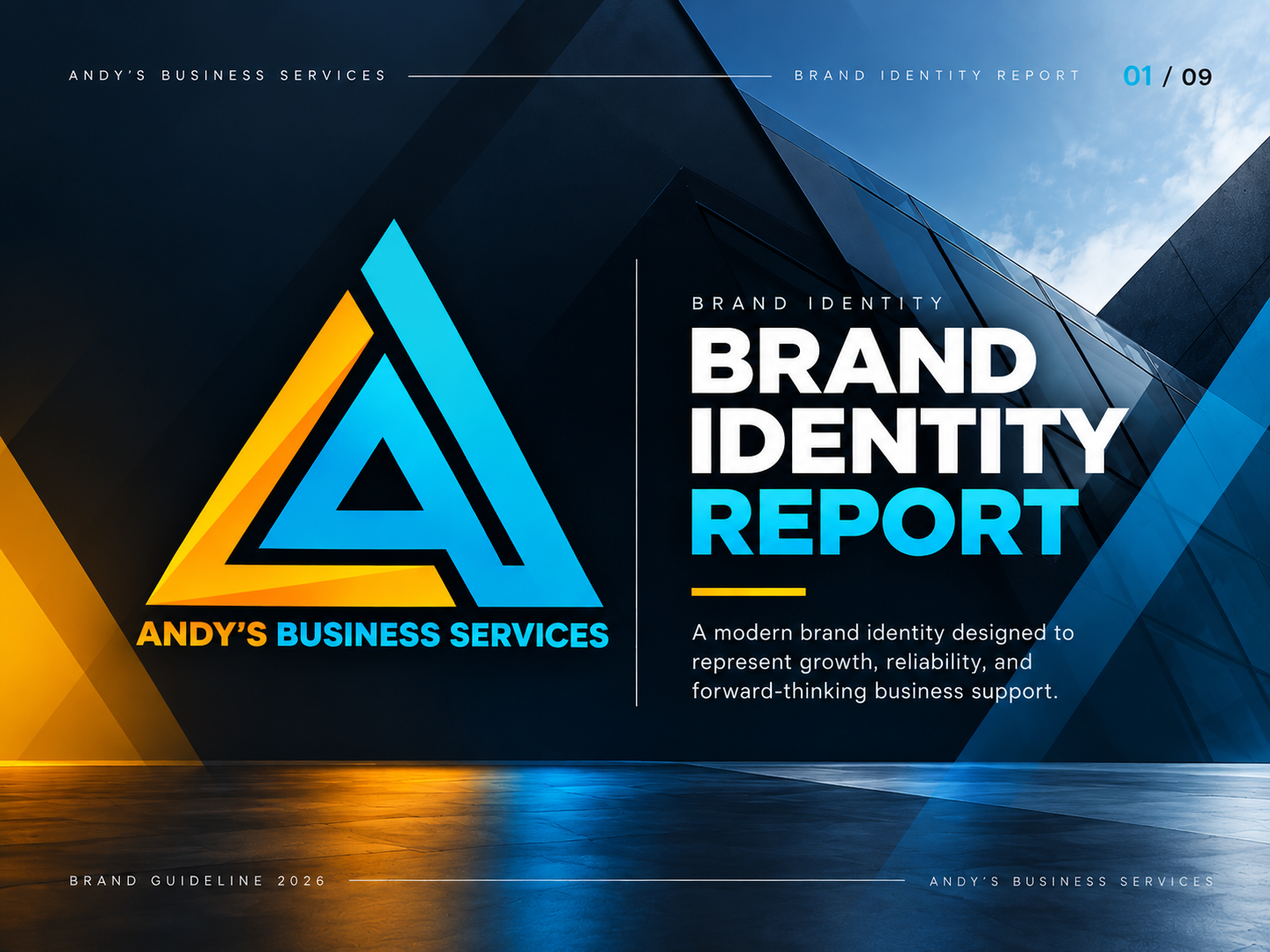
A modern and forward-thinking brand identity designed for Andy’s Business Services. This project transforms a business name into a cohesive visual identity through a distinctive geometric logo, vibrant color palette, refined typography, and consistent brand applications.
The result is a professional branding system that communicates trust, growth, reliability, and a strong business presence across digital and physical platforms.
- Client
- Andy's Business Services
- Category
- Branding
- Industry
- Professional Services
- Timeline
- 2 Days
Project Overview
The Challenge
Andy’s Business Services needed a distinctive and professional visual identity that could represent its business values while establishing a recognizable presence across different platforms.
The branding direction focused on creating a modern, confident, and forward-thinking identity that communicates reliability, business growth, and professional support.
The main challenge was to develop a visual identity that felt modern and distinctive while maintaining the credibility expected from a professional business services brand.
The identity needed to:
- Stand out through a memorable and recognizable logo.
- Communicate professionalism, trust, and reliability.
- Represent business growth and forward-thinking solutions.
- Maintain consistency across digital and printed materials.
- Provide a flexible visual system that could grow alongside the business.
The Solution
I developed a complete visual identity built around a custom geometric A monogram, combining dynamic triangular shapes with a vibrant cyan and amber color combination.
The visual direction was supported by a consistent typography system, complementary graphic elements, and a comprehensive brand guideline.
Rather than focusing solely on the logo, the solution established a unified brand language that could be applied across websites, business cards, social media, signage, and corporate materials.
Andy’s Business Services
Building a Modern Brand Identity for Business Growth
Project Overview
Client: Andy’s Business Services
Project: Brand Identity & Visual Branding
Industry: Business Services
Services: Logo Design, Brand Identity, Visual System, Brand Guidelines, Graphic Design
Design Direction: Modern, Geometric, Professional, Forward-Thinking
01. The Concept
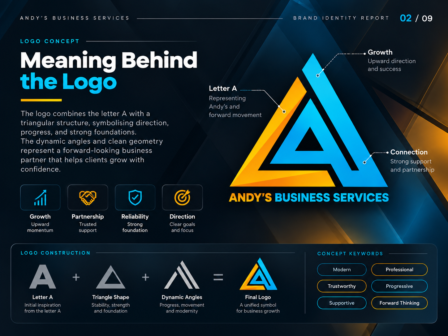
The foundation of this identity is a custom geometric logo inspired by the letter "A", representing Andy’s Business Services.
The symbol combines triangular structures and dynamic angles to communicate three essential brand values:
- Growth: Upward movement represents progress, ambition, and new opportunities.
- Connection: Interconnected geometric elements represent collaboration, partnership, and business support.
- Foundation: The triangular structure represents stability, reliability, and a strong foundation.
The result is a distinctive symbol designed to be recognizable, versatile, and adaptable across different brand applications.
02. Color Strategy
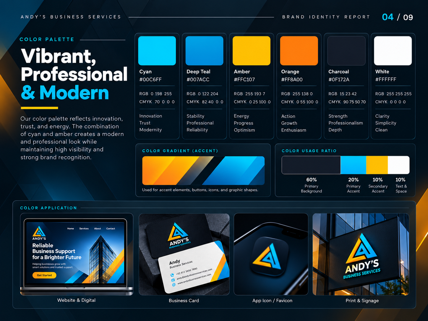
The color palette combines vibrant cyan, deep teal, amber, and orange with neutral charcoal and white.
Each color contributes to the overall brand personality:
- Cyan: Innovation, clarity, and modernity.
- Deep Teal: Stability, professionalism, and reliability.
- Amber: Energy, optimism, and opportunity.
- Orange: Action, confidence, and growth.
- Charcoal: Strength, sophistication, and depth.
- White: Simplicity, clarity, and balance.
Together, these colors create a distinctive visual identity that balances professional credibility with a contemporary appearance.
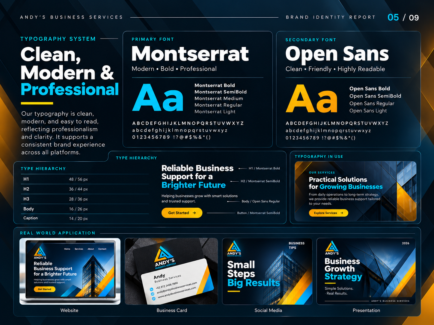
03. Typography System
Typography plays an important role in maintaining clarity and consistency throughout the brand.
The system uses two complementary typefaces:
Montserrat – Primary Typeface
Used for headlines, brand statements, titles, and prominent communication elements. Its geometric structure creates a confident and contemporary appearance.
Open Sans – Secondary Typeface
Used for supporting text, descriptions, and longer content. Its excellent readability ensures clear communication across digital and printed materials.
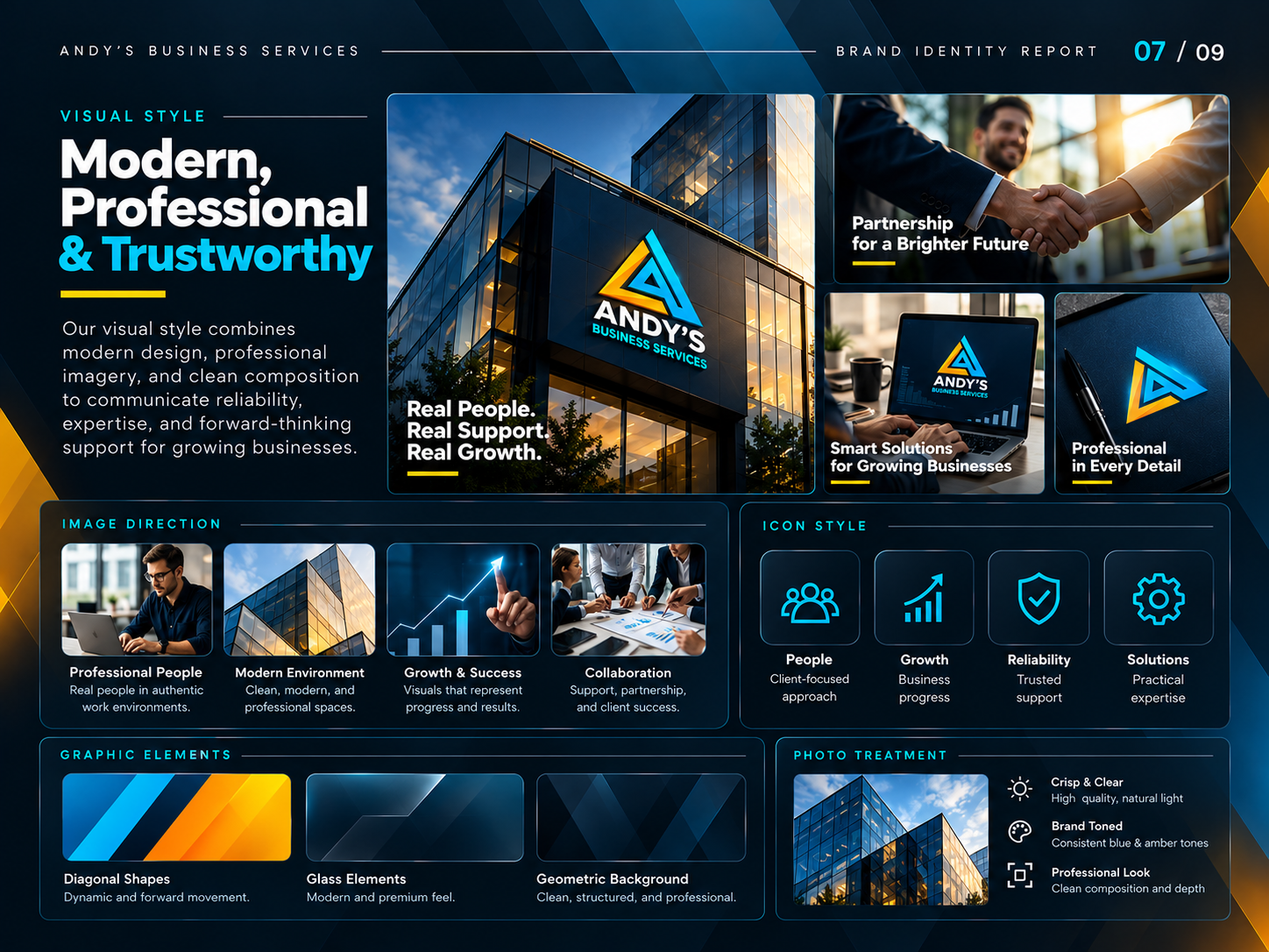
04. Visual Language
To strengthen the brand beyond its logo, I developed a supporting visual language inspired by the geometric structure of the symbol.
Key elements include:
- Diagonal shapes representing forward movement.
- Geometric patterns inspired by the logo construction.
- Structured layouts and clean compositions.
- Cyan and amber accents for visual emphasis.
- Consistent iconography representing growth, support, reliability, and solutions.
These elements create a flexible design system that can be extended across different communication channels.
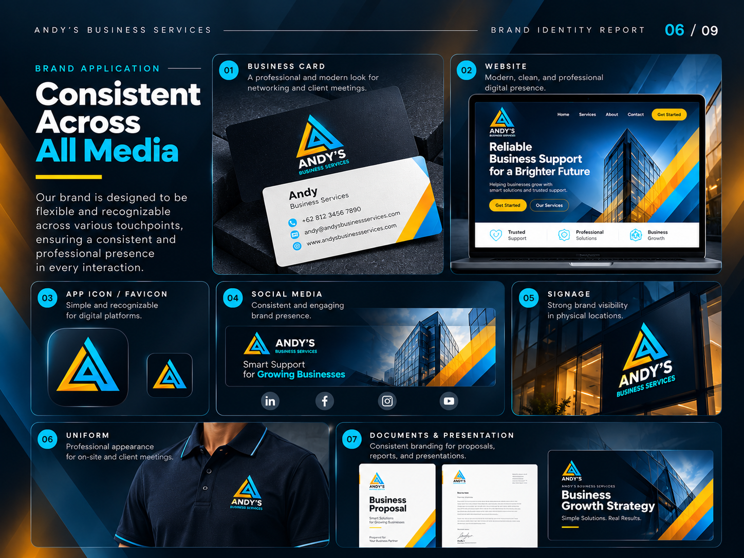
05. Brand Applications
The identity was developed with practical applications in mind, ensuring consistency across multiple brand touchpoints.
Business Stationery
Business cards and corporate documents establish a professional first impression during client interactions and business networking.
Digital Presence
Website concepts and digital layouts demonstrate how the identity can translate into a modern and professional online experience.
Social Media
Branded social media templates create a recognizable visual presence for digital communication, marketing, and business updates.
Signage & Environmental Branding
The logo and supporting graphics are designed to maintain visibility and recognition in physical environments.
Corporate Materials
Presentation slides, business proposals, email signatures, and other branded materials complete the visual communication system.
06. Brand Guidelines
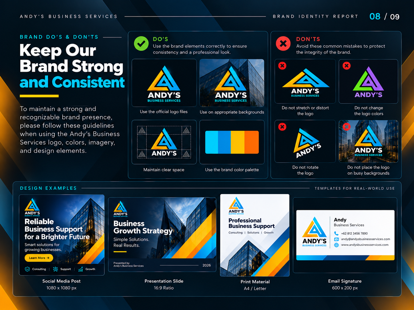
To maintain consistency as the business grows, I developed a nine-slide brand identity report covering:
- Brand Identity Overview
- Meaning Behind the Logo
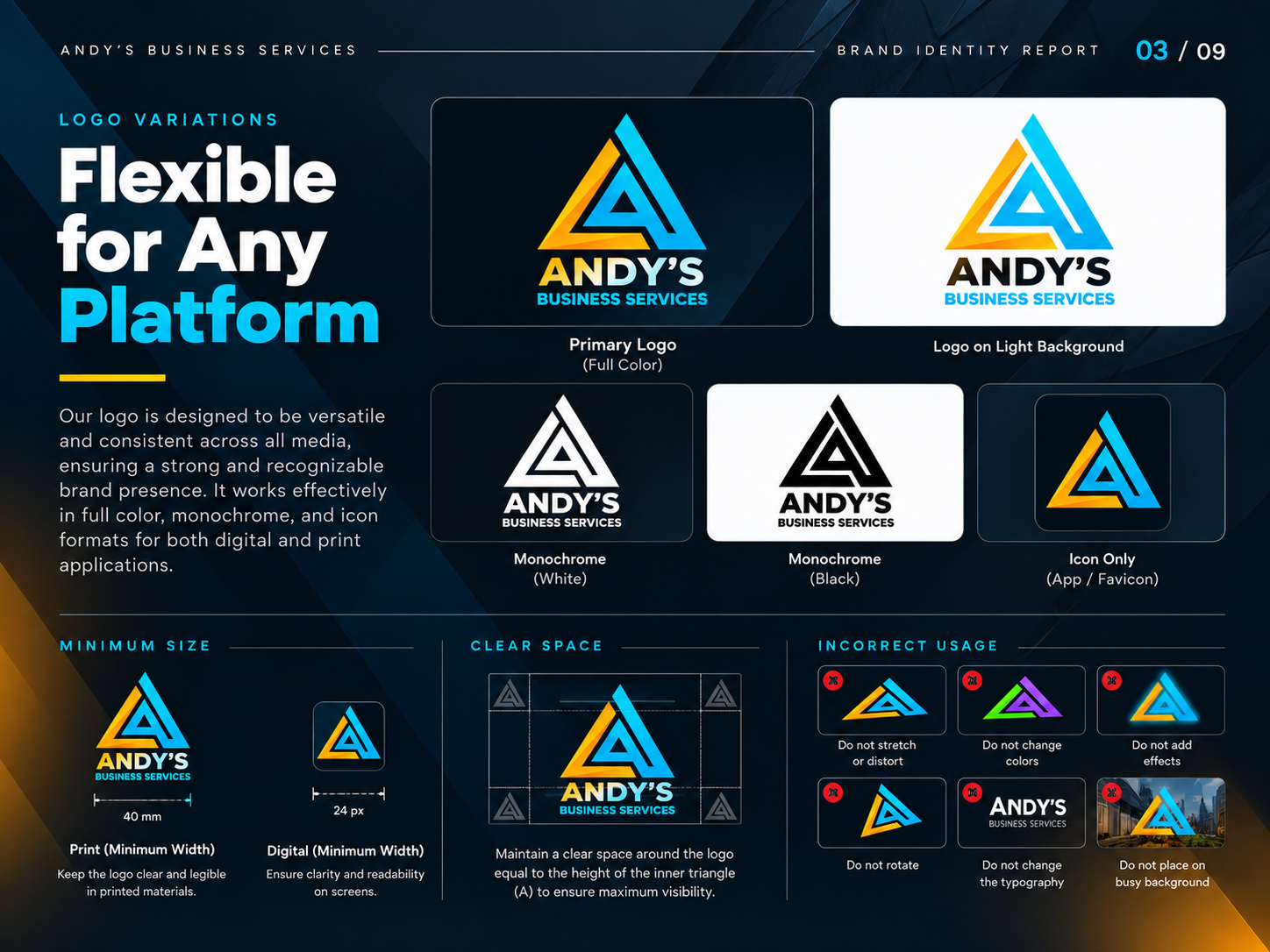
- Logo Variations & Usage
- Color Palette & Brand Colors
- Typography System
- Brand Applications
- Visual Style & Brand Imagery
- Brand Do’s & Don’ts
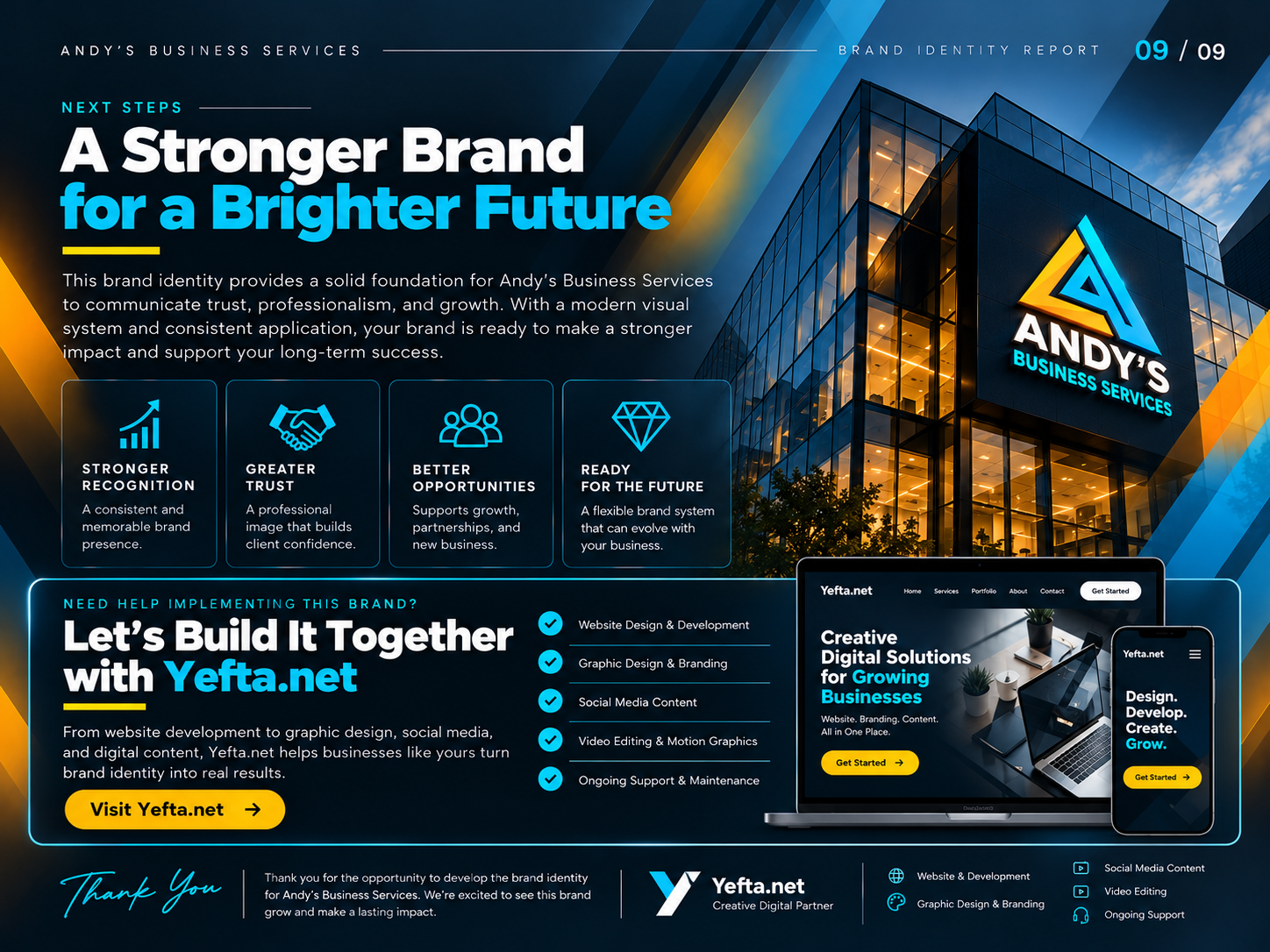
- Next Steps & Brand Implementation
The guideline provides a practical reference for maintaining the visual identity across future marketing and communication materials.
07. The Outcome
The project establishes a cohesive visual foundation for Andy’s Business Services.
From the geometric logo to the supporting typography, color palette, and brand applications, every element works together to communicate a consistent brand personality.
The identity is designed to position the business as modern, professional, reliable, and ready for future growth.
More than just a logo, it is a complete visual language built to support the business across digital and physical touchpoints.
Let's Build a Stronger Brand Together
Your business deserves an identity that communicates its value, builds recognition, and creates a lasting impression.
At Yefta.net, I help businesses turn ideas into meaningful visual identities and digital experiences.
Services include:
- Brand Identity & Logo Design
- Website Design & Development
- UI/UX Design
- Graphic Design & Branding
- Social Media Design
- Digital Content & Video Editing
Have a project in mind? Let's create something meaningful together.
Yefta.net — Creative Digital Partner.
Gallery
From brand to website
For Andy's Business Services, the brand and the website were designed as one project. That keeps everything consistent: the same colours, type and tone of voice carry from the logo to every page, button and image.
The identity was finished first, then turned into web layouts — what visitors need to see first, how the key sections flow and where the calls to action sit — so the site feels like the brand, not a template with a logo on top.
Because both parts come from the same designer, there is no hand-off gap between the brand agency and the web team: decisions about colour, imagery and tone are made once and applied everywhere, which saves time and keeps the result consistent.
Planning something similar? See my brand identity service or estimate your project.
- 1
Brand identity
Logo, colour palette and typography as a reusable system.
- 2
Web layouts
Key pages designed for desktop and mobile using the new brand.
- 3
Launch assets
Files and guidelines so the team can keep everything on-brand.
Related projects
Have a project in mind?
Tell me about your goals. I’ll reply within one business day with a clear next step — or get an instant estimate with the calculator.